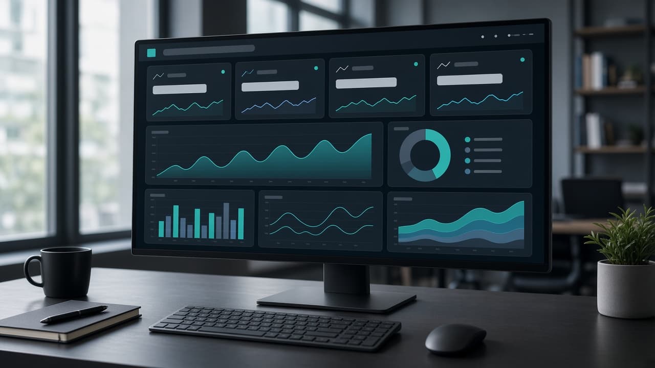
Business Dashboards That Drive Decisions (Not Just Pretty Charts)
Most dashboards get built, demoed once in a leadership meeting, and quietly ignored after that. Here's how to design a business dashboard people actually open every day — and use to make real calls.
The Dashboard Graveyard: Why Most Dashboards Get Ignored After Week Two
Walk into almost any growing company and you'll find at least one dashboard that was a big deal when it launched. Someone presented it in an all-hands. It had a nice color palette, a handful of charts, maybe a live counter ticking upward. Three weeks later, nobody's opened it since the demo. The spreadsheet it was supposed to replace quietly came back.
We've rebuilt several of these 'dashboard graveyards' for clients, and the pattern is remarkably consistent. The dashboard wasn't wrong, exactly — the charts were accurate, the numbers updated fine. It just didn't answer a question anyone actually had at the moment they needed an answer. It was built to look impressive in a demo, not to get opened during a Tuesday morning operations meeting when someone needs to decide whether to reorder stock or follow up with a stalled sales lead.
This is the core distinction most failed dashboard projects miss: a dashboard isn't a report. A report tells you what happened. A good dashboard helps you decide what to do next, right now, with the information in front of you. That difference changes almost every decision in how you design one — from what metrics you include to how the screen is laid out.
This article walks through how we approach dashboard projects at ZEE Sol Tech, step by step, from figuring out which decisions actually need support, through metric selection, data pipelines, and the rollout process that determines whether a dashboard gets used six months after launch or forgotten within a quarter.
What a Dashboard Is Actually For
A useful business dashboard exists to shorten the distance between noticing something and acting on it. If your operations manager has to export data, open it in a spreadsheet, build a pivot table, and then decide whether staffing looks off for next week, that's a thirty-minute detour that happens maybe once a month, if at all. A good dashboard turns that into a thirty-second glance that happens every single day.
That reframing matters because it changes what 'success' looks like for the project. A dashboard that gets admired once and never opened again has failed, no matter how polished it looks. A dashboard with plain bar charts that three managers check every morning before their stand-up has succeeded, even if it's visually unremarkable.
It also means a dashboard's value is tied directly to specific people and specific routines. 'Give us visibility into the business' is not a brief we can design against — it's too vague to build anything useful from. 'Help our warehouse lead know by 8am which SKUs are at risk of stocking out this week' is a brief we can actually turn into something people will use.
Step 1: Start With the Decision, Not the Data
The single biggest mistake in dashboard projects is starting with 'what data do we have' instead of 'what decision are we trying to support.' Starting from available data produces a dashboard full of everything that was easy to pull — which is exactly how you end up with fifteen charts and zero daily users.
Instead, sit down with the actual people who'll use the dashboard and ask them to walk through their week. When do they currently make a judgment call with incomplete information? What do they wish they knew at that moment? A sales manager deciding which accounts to prioritize this week needs something very different from a finance lead watching cash runway, even if both sit under the same company umbrella.
We usually run this as a short series of interviews before any design work starts, specifically asking: 'Tell me about the last time you had to guess because you didn't have the number you needed.' Those stories are gold. They tell you exactly which metric, refreshed at exactly what cadence, would have changed the outcome.
Once you have that list of real decisions, rank them. You don't need a dashboard that serves every decision every department makes — you need one that nails the two or three decisions that happen often enough, and matter enough, to justify building and maintaining it.
Step 2: Pick the Right Metrics
Once you know the decisions you're supporting, choosing metrics gets much easier — you're no longer picking from 'everything that sounds impressive' but from 'what specifically answers this question.' Still, most teams make two recurring mistakes here worth calling out separately.
Leading Indicators vs Lagging Indicators
A lagging indicator tells you what already happened — last month's revenue, last quarter's churn rate. These matter for reporting, but they're useless for decisions, because by the time you see them, it's too late to change the outcome they describe.
A leading indicator gives you a heads-up before the lagging number lands. Support ticket volume trending up is a leading indicator for churn next month. Quote-to-close time stretching out is a leading indicator for a rough sales quarter. A decision-focused dashboard should lean heavily toward leading indicators, with lagging indicators reserved for a separate, less frequently checked reporting view.
Vanity Metrics to Avoid
Total signups, total downloads, total pageviews — these numbers only ever go up, which makes them satisfying to look at and almost useless for making a decision, because an ever-climbing total doesn't tell you anything about what's happening right now. If a metric can't realistically go down in a way that would prompt someone to act, it probably doesn't belong on a decision-focused dashboard.
A good test: imagine the number drops 20% tomorrow. Would anyone notice, and would it change what they do that day? If the honest answer is 'no, people would just shrug,' that metric is decoration, not a dashboard component.
Step 3: Design for the 5-Second Glance
The people using your dashboard are busy. They're not going to study it like a research report — they're going to glance at it between meetings, form a quick read, and move on. If the most important number on the screen isn't immediately obvious, you've lost most of the dashboard's value before anyone even reads the smaller details.
Visual hierarchy matters more than chart variety here. Put the number that drives the most important decision in the largest, most prominent spot on the screen. Use color sparingly and consistently — red should always mean the same kind of 'needs attention' across every chart, not red in one widget and orange for the equivalent warning in another.
Resist the instinct to show every possible breakdown on the main screen. A dashboard with twelve charts competing for attention is harder to scan than one with four clear numbers and a drill-down option for people who want more detail. Put the detail one click away, not front and center.
We also recommend testing the dashboard with the actual target user, live, in a real meeting if possible. Watch where their eyes go first. If it's not the number you intended, that's useful information — fix the layout before rolling it out company-wide, not after.
- One clear hero metric per dashboard view, not a wall of equal-sized widgets
- Consistent color meaning across every chart (red always means the same thing)
- Detail available on click, not crammed onto the main screen
- Numbers large enough to read at arm's length on a shared office screen
Step 4: Choosing Your Data Sources and Pipeline
A dashboard is only as trustworthy as the data feeding it, and this is usually where projects quietly get more complicated than anyone expected during the initial pitch. It's worth planning this part carefully before committing to a launch date.
Connecting Live Systems
Most dashboards pull from a mix of sources — a CRM, a payments processor, an inventory system, maybe a support ticket tool. Each of these has its own API, its own rate limits, and its own quirks about how data is structured. Mapping these out early, including which fields actually mean what you think they mean, prevents a lot of rework later.
It's common to discover, partway through a build, that two systems define the same term differently — one counts a 'customer' as anyone who's ever signed up, another only counts people with an active subscription. Reconciling definitions like this before building charts avoids a dashboard that quietly shows wrong numbers nobody notices until a decision goes badly.
Handling Messy or Legacy Data
If some of your source data lives in an older system, a spreadsheet someone maintains by hand, or a database with years of inconsistent entry, budget real time for cleaning it before it ever reaches a dashboard. A beautiful chart built on inconsistent underlying data is worse than no dashboard at all, because it actively misleads people who trust the number on the screen.
Step 5: Build vs Buy — Off-the-Shelf BI Tools vs a Custom Dashboard
Tools like Looker, Power BI, and Tableau are genuinely good at what they do, and for some companies they're the right call, particularly if your team already has analysts comfortable building reports in them and your data sits in a handful of well-supported sources.
Where off-the-shelf tools start to strain is when your dashboard needs to be embedded directly into your own product or internal tool, when you need very specific interactions that aren't standard chart types, or when licensing costs scale uncomfortably as more people across the company need access. We've had clients move from a BI tool to a custom dashboard specifically because per-seat licensing made it too expensive to give everyone who needed it actual access.
A custom dashboard also wins when the decisions it supports are specific to how your business actually operates — a logistics company tracking delivery windows against weather data, for instance, isn't well served by a generic BI template. The upfront cost of custom development is higher than subscribing to an existing tool, but it's often cheaper over a few years once you factor in licensing at scale and the ability to shape it exactly around your workflows rather than working around a tool's assumptions.
Step 6: Permissions and Roles — Who Sees What
Not everyone who uses a dashboard should see everything on it. A regional manager probably needs their region's numbers front and center, not buried in a company-wide view they have to filter every time. Finance data often needs tighter access controls than operational metrics that are fine for a wider team to see.
Plan role-based views early rather than bolting them on later. Retrofitting permissions into a dashboard that was built assuming 'everyone sees everything' is a meaningfully bigger job than designing for it from the start, especially once multiple teams have already built habits around the existing layout.
This is also where a thoughtful default view matters. If someone logs in and has to build their own filtered view every time before the dashboard is useful to them, you've added friction that quietly discourages daily use. The right default for each role should require zero setup.
Audit trails matter more than people expect
Once a dashboard starts influencing real decisions — pricing changes, staffing calls, inventory orders — someone will eventually ask 'who saw this number, and when?' A basic audit trail showing who accessed which view, and when a given metric last refreshed, saves a lot of back-and-forth during a disagreement about why a decision was made a certain way.
This doesn't need to be elaborate. Logging access at the role level, plus a visible 'last updated' timestamp on every chart, covers most of the accountability questions that come up in practice. Skipping this is fine for an internal pilot, but worth adding before a dashboard becomes a tool leadership relies on for real calls.
Step 7: Real-Time vs Scheduled Refresh
Real-time data sounds impressive, but it's not always worth the engineering cost. If a metric genuinely needs to reflect what's happening this minute — live order volume during a flash sale, system uptime during a launch — real-time refresh earns its complexity. If the decision it supports only gets made once a day, an hourly or nightly refresh is simpler to build, cheaper to maintain, and just as useful.
Match the refresh rate to how often the decision actually gets made, not to what sounds most technically impressive. Over-engineering real-time pipelines for metrics that get checked once a week is a common place we see budgets get spent on the wrong priority.
Step 8: Mobile and On-the-Go Access
A lot of dashboard projects get designed exclusively for a desktop monitor and then quietly fail for the field manager, the delivery lead, or the executive who's mostly checking numbers from a phone between meetings. If your actual users are mobile for a meaningful part of their day, a responsive or dedicated mobile view isn't optional — it's where a chunk of your real usage will happen.
This doesn't mean cramming the full desktop layout onto a small screen. It usually means a simplified mobile view with the one or two hero metrics front and center, and the detailed breakdowns reserved for when someone's actually at a larger screen.
Common Dashboard Mistakes That Kill Adoption
A handful of mistakes show up repeatedly across dashboard projects, regardless of industry. Watching out for these during the build saves a lot of frustration after launch.
- Building for every stakeholder's wish list instead of a specific, prioritized decision
- Choosing metrics that look good in a demo instead of ones that change daily behavior
- Shipping a desktop-only design when key users are mostly on mobile
- Skipping a rollout plan and assuming people will just discover and adopt it on their own
- Letting data quality issues slide, which quietly erodes trust in every number on the screen
- Adding every requested chart instead of protecting the clarity of the main view
How to Roll Out a New Dashboard So People Actually Use It
Launching a dashboard is a change management problem as much as a technical one. People have existing habits — a spreadsheet, a weekly email report, a gut feeling built from experience — and a new tool has to earn its way into that routine, not just technically exist as an option.
Pick one or two champions on the team who'll use the dashboard daily and can vouch for it to colleagues. Walk them through it personally, get their honest reaction, and fix anything confusing before a wider rollout. A dashboard that one real person actively relies on and recommends spreads through a team far faster than one introduced only through a company-wide announcement.
Retire the old reporting method deliberately, rather than letting the dashboard exist alongside the spreadsheet indefinitely. If the old spreadsheet still gets updated every week 'just in case,' most people will default back to the familiar option, and the dashboard quietly becomes the thing nobody actually relies on.
Choosing a Partner to Build Your Dashboard
A good dashboard partner spends more time asking about your team's actual decisions than showing you chart templates. If the first conversation jumps straight to 'we can connect to any data source and build any chart you want,' without asking what decision you're trying to support, that's a sign the project will end up data-driven in the wrong sense — built around whatever's easy to pull rather than what's actually useful.
Ask to see a dashboard they've built that's still actively used a year after launch, not just screenshots from a launch demo. Ask what they'd change about it now. The honest answer to that question tells you a lot about whether they think about dashboards as living tools or one-time deliverables.
At ZEE Sol Tech, we scope dashboard projects by starting with a short discovery phase focused entirely on decisions and users before we talk about charts or tech stack. It's a slightly slower start than jumping straight into design, but it's the step that determines whether the dashboard gets opened every morning or forgotten by the second month.
Measuring Whether Your Dashboard Is Actually Working
Most teams never formally check whether a dashboard is succeeding — they just notice, months later, that nobody opens it anymore. It's worth defining what success looks like before launch, rather than hoping it'll be obvious afterward. A dashboard that's working shows up in behavior, not just in positive feedback during a demo.
The clearest signal is simple login or view frequency. If the people the dashboard was built for are checking it daily or weekly, without reminders, that's a strong sign it's earned a place in their routine. A steep drop-off in views a month after launch, even after a positive initial reaction, usually means the dashboard answered a question people liked seeing answered once, but not one they need answered repeatedly.
A second signal worth watching: are the old habits actually disappearing? If the spreadsheet the dashboard was supposed to replace is still getting updated every week 'just in case,' that's a sign trust hasn't fully transferred yet, even if people glance at the dashboard occasionally. True adoption looks like the old method quietly dying out, not coexisting indefinitely alongside the new one.
Finally, ask the people using it directly, a few weeks after launch: has this changed anything about how you make a specific decision? A vague 'yeah, it's nice to have' answer is a softer signal than someone describing an actual moment where the dashboard changed what they did. If you can't get a concrete example after a few weeks of real use, it's worth revisiting whether the dashboard is actually anchored to a real decision, or whether it drifted back toward being a nice-to-look-at report.
- Track login or view frequency per role, not just total dashboard opens
- Watch whether the old spreadsheet or manual report is actually being retired
- Ask users directly for a specific decision the dashboard changed, not just general sentiment
- Revisit metric selection quarterly as the business and its priorities evolve
Ready to Build a Dashboard People Actually Use?
If your team is drowning in spreadsheets, or you've already got a dashboard that nobody opens anymore, the fix usually isn't more charts — it's a tighter focus on the decisions that actually matter day to day.
Tell us about the decision your team struggles to make quickly right now, and we'll help you work out what a dashboard that actually earns daily use would look like for your business.
Frequently asked questions
How is a custom dashboard different from a report in tools like Excel or Power BI?+
A report tells you what already happened, usually reviewed on a schedule. A well-designed dashboard is built around a specific, recurring decision and is checked far more often — often daily — because it directly shortens the time between noticing something and acting on it. Tools like Power BI can absolutely be used to build dashboards, but the design discipline matters more than the tool: a Power BI report built like a static document will get ignored just as fast as a custom one built the same way.
How long does it take to build a custom business dashboard?+
A focused dashboard covering one or two key decisions, pulling from a couple of well-structured data sources, typically takes six to ten weeks including discovery, design, and development. Timelines stretch when data needs significant cleanup, when multiple legacy systems need to be connected, or when the dashboard needs detailed role-based permissions from day one.
Should we use an off-the-shelf BI tool or build something custom?+
Off-the-shelf tools like Looker, Tableau, or Power BI work well when your data lives in well-supported sources and your team already has people comfortable building in them. A custom dashboard tends to make more sense when you need it embedded in your own product, need interactions a standard BI tool doesn't support, or when per-seat licensing costs would make broad internal access too expensive.
Why do so many dashboards stop getting used after launch?+
Most abandoned dashboards were built around available data rather than a specific, recurring decision someone actually needs to make. Without that anchor, the dashboard ends up full of metrics that look fine in a demo but don't change what anyone does day to day, so it quietly loses out to the spreadsheet or gut feeling people were already using.
Do we need real-time data for our dashboard?+
Only if the decision it supports genuinely needs minute-by-minute information, like live order volume during a sale or system uptime during a launch. For most operational and management decisions, an hourly or daily refresh is simpler to build, cheaper to maintain, and just as effective, since the decision itself doesn't change minute to minute.
Can a dashboard pull data from multiple systems like our CRM and inventory software at once?+
Yes, and that's actually one of the strongest arguments for a custom dashboard over a single vendor's built-in reporting. It does require mapping out how each system defines shared concepts like 'customer' or 'active order' so the combined numbers are accurate, which is part of why we run a dedicated discovery phase before development starts.
How do you make sure people actually adopt a new dashboard instead of going back to spreadsheets?+
Adoption is a rollout problem as much as a design one. We recommend identifying one or two team champions who'll use it daily, gathering their honest feedback before a wider launch, and deliberately retiring the old reporting method instead of letting it run in parallel indefinitely. Dashboards that coexist with the old spreadsheet forever rarely win people over.
How do we know if our dashboard is actually succeeding after launch?+
Watch behavior, not sentiment. Track how often the intended users actually log in or check the dashboard without being reminded, and watch whether the spreadsheet or report it was meant to replace is genuinely being retired. If you can get someone to describe a specific decision the dashboard changed, that's a far stronger signal of success than general positive feedback in a meeting.
Keep reading
Related articles

E-Commerce Website Features That Actually Sell (Not Just Look Nice)
A beautiful online store with a clunky checkout still loses sales. Here's a practical rundown of the e-commerce features that genuinely move the needle on conversion rate — and the ones that are mostly for show.

The SEO-Friendly Website Checklist Every Business Needs Before Launch
Plenty of agencies claim their websites are 'SEO-friendly' and then hand over a site with slow load times, broken heading structure, and zero thought given to how search engines actually crawl it. Here's the checklist that matters.

When You Actually Need Custom Software Development (And When You Don't)
Custom software isn't always the right call — sometimes a well-configured off-the-shelf tool does the job for a fraction of the cost. Here's how to tell the difference before you commit a budget to a build.