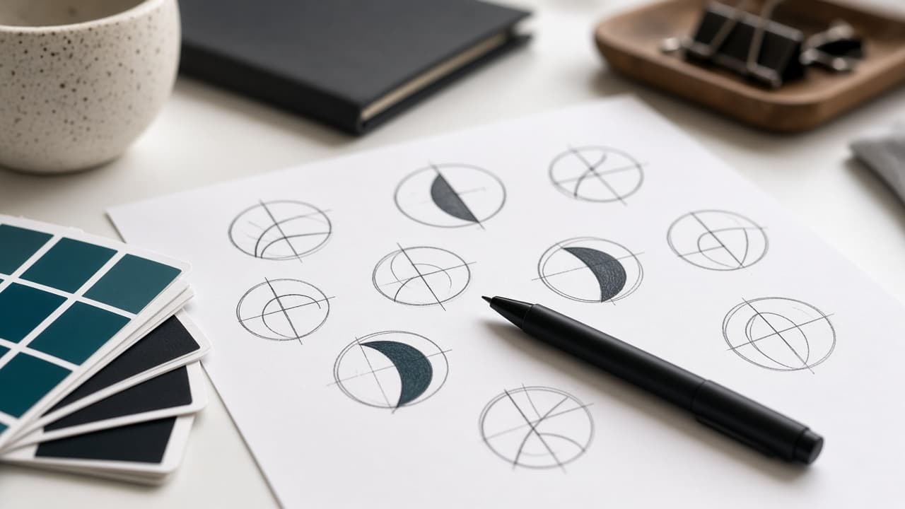
7 Logo Design Mistakes That Quietly Hurt Your Brand
A logo isn't just a cute mark in the corner of your site. These common, easy-to-miss mistakes make brands look amateur — and they cost far more to fix later than getting it right the first time.
A logo is doing more work than people give it credit for
It's easy to treat a logo like a small decorative task — something you knock out quickly so you can get to the 'real' marketing work. That mindset is exactly how brands end up with marks that quietly undermine them for years. A logo is a trust shortcut. In the half-second someone glances at it, they're forming an impression of whether your business is credible, current, and worth their attention.
Think about how often your logo actually gets seen without context: a tiny favicon in a browser tab, a social media avatar the size of a coin, a watermark on an invoice, a sticker on a laptop. In most of those moments, there's no tagline, no color story, no supporting copy to explain what you do. The mark has to carry the impression alone.
That's a lot of pressure for a small graphic, which is exactly why the mistakes below matter more than they seem to at first glance. None of them are really about taste. They're about function — does the logo actually work in the real conditions it will live in, under the pressure it will actually face?
We put this list together after years of fixing other people's logo problems during rebrands at ZEE Sol Tech. The same handful of issues keep showing up, across completely unrelated industries, which tells you they're not random — they're predictable traps that are easy to fall into without a trained eye checking the work.
Mistake 1: Trying to say everything in one mark
When a logo tries to represent the full personality of a company — the industry, the values, a clever visual pun, initials, and a tagline, all crammed into one icon — it usually ends up communicating none of it clearly. The brain can hold one strong idea from a glance. It can't hold five.
This mistake is especially common with businesses that feel like they have a lot to say. A logistics company wants to show speed and reliability and global reach and trustworthiness, all in a single icon, and the result is a busy shape that means nothing specific to anyone looking at it for the first time.
The strongest logos usually win by committing to one clear idea you could sketch from memory on a napkin. Nike's swoosh. The Apple icon. These aren't complicated illustrations — they're single, confident shapes. If your current mark needs a paragraph of explanation before someone 'gets it,' that's the signal to simplify, not to add more.
A useful exercise: ask someone outside your company to describe your logo back to you after seeing it for three seconds. If they struggle, it's not their fault — it's a sign the mark is trying to do too much at once.
Mistake 2: Designing for your own taste instead of your audience's trust
Founders often have strong personal opinions about color and style, which makes sense — it's their business. But a logo isn't a personal art project. It's a signal aimed at a specific audience, and that audience might respond to very different visual cues than the founder's personal preferences.
A playful, rounded, pastel logo might feel fun and approachable to its creator but can quietly undercut trust for a B2B financial services firm whose buyers expect gravity and precision. Likewise, an overly corporate, stiff mark can feel cold and uninviting for a lifestyle brand trying to connect with a younger, informal audience.
The fix isn't to abandon personal taste entirely — it's to filter it through the lens of who actually needs to trust this brand enough to buy from it. Good brand designers ask about your audience before they open a design tool, because the right answer depends entirely on who's looking.
- Who specifically needs to trust this logo at first glance?
- What do your top three competitors' logos signal, and do you want to blend in or stand apart?
- Would your ideal customer describe your current mark as 'professional,' 'playful,' or 'dated'?
Mistake 3: It only works on a white background
A logo designed and approved only on a clean white background can fall apart the moment it hits real-world conditions — dark app interfaces, colored packaging, a photo-heavy website hero section, a branded tote bag. If a logo only has one 'good' version, it's unfinished.
This is one of the most common issues we catch during brand audits. The founder loved the full-color version in the pitch deck, nobody tested the single-color version, and six months later the marketing team is stretching, squashing, and recoloring the mark in ways that slowly erode consistency.
The favicon and app icon test
Shrink your logo down to 32 by 32 pixels — the size of a browser tab icon. If fine details vanish into a blur, your mark isn't ready for the small-format reality of modern digital branding, where tiny icons are often the only visible brand touchpoint for a browsing user.
The single-color and print test
Try the logo in pure black, pure white, and a single brand color with no gradients. If it only looks 'right' with the full gradient and gloss effects, it will cause problems the moment it needs to go on a stamp, an embroidered polo, or a black-and-white fax cover sheet from an older partner's system.
Mistake 4: Chasing the trend of the moment
Design trends move fast — gradient blobs, specific typefaces, overly literal icon styles that feel fresh for about eighteen months and then suddenly feel dated. Logos designed purely to look 'current' often age the fastest, which means a costly redesign sooner than expected.
That doesn't mean a logo should ignore modern design entirely and look stuck in the past. The goal is a mark that feels contemporary without leaning so hard on a specific trend that it becomes a visual timestamp. Think about how many 2015-era 'flat gradient app icon' logos look noticeably dated today.
A simple test: look at your proposed logo next to logos from brands that have lasted twenty-plus years. The ones that aged well tend to be simple, confident shapes rather than trend-driven illustrations. If your new mark leans heavily on a style you've seen explode on design inspiration feeds this year, ask your designer directly how it will hold up in five years, not five months.
Mistake 5: No typography pairing or color system around it
A logo doesn't operate alone. It needs a consistent typeface for headlines and body copy, a defined color palette with usage rules, and some sense of visual tone — all working together so that every page, ad, and social post feels like it belongs to the same company.
Without this system, teams improvise. The marketing person picks a font they like for a flyer. The web developer uses whatever the website theme defaults to. The person running paid ads grabs a 'close enough' shade of blue. Individually these choices seem harmless. Collectively, they make a brand look accidental and inconsistent across every channel it appears on.
A proper identity system doesn't need to be a sixty-page corporate manual for a small business — even a one-page cheat sheet with approved colors (with hex codes), two fonts, and basic logo spacing rules prevents most of this drift. The investment is small relative to the consistency it buys you.
Mistake 6: Skipping the scalability test entirely
A logo that looks sharp as a large hero graphic on a homepage can completely fall apart shrunk down to a social media profile picture, an email signature, or a tiny app icon. Scalability isn't a nice-to-have — it's one of the core technical requirements of a working logo in 2026, where most brand impressions happen on small screens.
Fine serifs, thin line work, and intricate details that look elegant at large sizes often blur into mush at small sizes, especially on lower-resolution displays or when compressed by social platforms that re-encode uploaded images. If a designer hasn't shown you the mark at multiple sizes before final approval, ask for it before you sign off.
- Test the logo at 500px, 100px, and 32px side by side
- Avoid ultra-thin strokes that vanish on standard mobile screens
- Check legibility after the kind of compression social platforms apply to uploaded images
Mistake 7: Treating the logo file as 'done' with no usage guidelines
Delivering a logo without any guidance on spacing, minimum size, acceptable color variations, and what not to do is like handing someone a car with no owner's manual. They'll figure out something that works, eventually, but probably not the way you intended, and usually after a few visible mistakes.
Usage guidelines don't need to be elaborate. A short document showing clear space around the mark, approved color variations, a few 'don't do this' examples (stretching, recoloring outside the palette, adding drop shadows), and the correct file formats for web versus print prevents the slow drift that turns a sharp brand into a messy one within a year.
This is part of what separates a logo from a brand identity. One is a graphic. The other is a system that keeps every future touchpoint — your website, your packaging, your next hire's PowerPoint deck — looking like it came from the same company.
One more risk worth checking: trademark conflicts
It's not technically one of the seven design mistakes above, but it's common enough, and expensive enough when it goes wrong, that it deserves a mention here. A logo that's visually similar to an existing trademarked mark in your industry — even unintentionally — can trigger a cease-and-desist letter, forced rebranding costs, and in some cases legal fees, months or years after you've already built brand recognition around it.
This risk goes up specifically when businesses lean on free logo generators or very literal, common industry iconography (a stylized leaf for anything wellness-related, a generic shield for anything security-related). The more a mark resembles the industry default, the higher the odds it also resembles something someone else already registered.
A basic trademark search in your relevant category and region before finalizing a logo is a cheap insurance policy relative to the cost of discovering a conflict after the mark is already on your storefront, your packaging, and two years of marketing materials. It's not a step most small businesses think to take, but it's a quick one worth adding to your launch checklist.
Gathering feedback without design-by-committee
Involving your team in logo feedback is reasonable — they'll be living with this mark every day too. The problem isn't getting input, it's how that input gets collected and weighed. Open-ended group critique sessions, where everyone shares personal taste in real time, reliably produce a diluted, compromise design that nobody actively dislikes but nobody's genuinely excited about either.
A better approach: share concepts individually, ask specific questions rather than 'what do you think' — does this feel trustworthy to a new customer, is this readable at a glance, does this feel consistent with how we want to be seen — and have one decision-maker who actually weighs the feedback against the strategic brief, rather than averaging every opinion equally.
It also helps to separate reactions to the concept from reactions to personal color preference. 'I don't love blue' is a different kind of feedback than 'this doesn't feel like it represents what we do,' and treating them with the same weight is how a strong, distinctive concept gets sanded down into something generic by the fifth round of revisions.
- Share concepts individually rather than in an open group critique session
- Ask targeted questions tied to the brief, not just 'what do you think'
- Separate personal taste feedback from feedback about strategic fit
- Designate one final decision-maker to weigh input against the original brief
How to brief a designer so you get a mark that actually lasts
A weak creative brief produces weak logo options, no matter how talented the designer is. Vague instructions like 'make it modern and professional' leave too much room for mismatched interpretation. A strong brief gives a designer real constraints to work within — and constraints are what make creative work sharp instead of generic.
Share real examples of logos you admire and, just as importantly, logos in your industry you specifically don't want to resemble. Describe your actual customer, not just your product. Mention any symbolism, colors, or associations with meaning to your story — but stay open to the designer pushing back if a literal idea won't translate well into a clean mark.
- Three to five logos you like, with a sentence on what you like about each
- Three logos in your space you want to avoid resembling
- A one-paragraph description of your ideal customer
- Any non-negotiables: specific colors, symbols, or words that must appear
What a proper brand identity package should include
If you're investing in branding, make sure you walk away with more than a single logo file. A complete identity package gives you the tools to stay consistent across every channel without needing a designer on call for every small decision.
- Primary logo plus horizontal, stacked, and icon-only variations
- Black, white, and full-color versions, in both vector and raster formats
- A defined color palette with hex, RGB, and CMYK values
- Primary and secondary typefaces for headlines and body copy
- Minimum size and clear space usage rules
- A short one-page brand guide covering do's and don'ts
Refresh or full rebrand? How to tell which one you need
Not every logo problem requires starting from zero. A refresh — tightening up proportions, adjusting color, modernizing the typeface slightly — can solve most of the issues above while keeping brand recognition built up over years. A full rebrand makes sense when the core concept itself no longer fits the business.
If your logo mostly just feels dated or inconsistent across channels, a refresh is usually enough, and it's far less risky than throwing away years of recognition. If the business model has fundamentally changed, the name no longer fits, or the brand actively works against how you want to be perceived now, that's when a full rebrand earns its cost.
The compounding cost of getting it wrong
The real cost of a weak logo isn't the design fee you saved upfront — it's the slow accumulation of inconsistent marketing, missed trust signals, and an eventual rebrand that costs more than doing it properly would have the first time. Every flyer, website, and ad that uses an unfinished mark reinforces the inconsistency a little further.
This is why we treat branding as functional work at ZEE Sol Tech, not just an art project. A logo that passes the background test, the small-size test, and the usage-guideline test will keep paying off quietly for years, in every place your brand shows up, without anyone noticing the groundwork that made it possible.
Where to go from here
If any of these mistakes sound familiar when you look at your current logo, you're not alone — most businesses accumulate at least two or three of them without ever planning to. The fix usually doesn't require starting from scratch; it requires an honest audit and a focused round of corrections.
If you'd like a second opinion on whether your current mark is holding your brand back, or you're starting fresh and want a system built right the first time, our branding team at ZEE Sol Tech is happy to walk through it with you — reach out and tell us where things currently feel inconsistent, and we'll help you figure out whether you need a refresh or a full identity build.
Frequently asked questions
How much should a professional logo design cost?+
Pricing varies widely based on scope. A standalone logo with basic variations might run a few hundred dollars with a freelancer, while a full brand identity package — logo system, color palette, typography, and usage guidelines — from a studio typically runs into the low to mid thousands. Price usually reflects strategy and system depth, not just the final image.
How long does a good logo design process take?+
A thoughtful logo process, including discovery, concept exploration, and revisions, typically takes two to four weeks. Rushed one-day turnarounds usually skip strategy and testing, which is why they're more prone to the mistakes covered in this guide, like poor scalability or weak contrast on dark backgrounds.
Can I just use Canva or a free logo generator for my business?+
It can work as a temporary placeholder for a very early-stage business, but be aware you're often getting a template-based design with limited uniqueness and flattened image files rather than editable vectors. Plan to revisit it with a proper designer once the business has traction worth protecting.
What files should I receive from my logo designer?+
At minimum, you should receive editable vector files (AI or EPS/SVG), high-resolution PNGs with transparent backgrounds, and versions in full color, black, and white. If you only receive a single flattened JPG, ask for the source files — you'll need them for future resizing and formats.
How do I know if my brand needs a refresh versus a full rebrand?+
If your logo mostly feels dated, inconsistent, or technically unfinished but the core concept still fits your business, a refresh usually solves it. A full rebrand is worth considering when your business model, name, or positioning has fundamentally changed since the original logo was created.
Should my logo include a tagline?+
Generally, no — build the tagline as a separate, flexible element rather than baking it into the logo file itself. Taglines change more often than logos, and a logo locked together with specific wording becomes harder to update, translate, or use in contexts where the tagline doesn't fit.
What's the real difference between a logo and a brand identity?+
A logo is a single graphic mark. A brand identity is the full system around it — color palette, typography, imagery style, tone of voice, and usage rules — that keeps every touchpoint consistent. A strong brand identity makes a single logo file far more valuable and far more durable.
Should I check if my logo idea is already trademarked?+
Yes, ideally before finalizing a design. A basic trademark search in your industry and region is a cheap way to avoid discovering a conflict after you've already built recognition around a mark. This risk is higher with generic, literal industry iconography or free logo generator templates that may closely resemble existing registered marks.
How should I collect team feedback on logo concepts without ending up with a watered-down design?+
Share concepts one-on-one rather than in an open group session, and ask specific questions tied to your brief instead of general opinions. Separate feedback about strategic fit from pure personal taste, and have one person responsible for making the final call against the original goals — open-ended group critique tends to sand a strong concept down into something generic.
Keep reading
Related articles
E-Commerce Website Features That Actually Sell (Not Just Look Nice)
A beautiful online store with a clunky checkout still loses sales. Here's a practical rundown of the e-commerce features that genuinely move the needle on conversion rate — and the ones that are mostly for show.

The SEO-Friendly Website Checklist Every Business Needs Before Launch
Plenty of agencies claim their websites are 'SEO-friendly' and then hand over a site with slow load times, broken heading structure, and zero thought given to how search engines actually crawl it. Here's the checklist that matters.

When You Actually Need Custom Software Development (And When You Don't)
Custom software isn't always the right call — sometimes a well-configured off-the-shelf tool does the job for a fraction of the cost. Here's how to tell the difference before you commit a budget to a build.