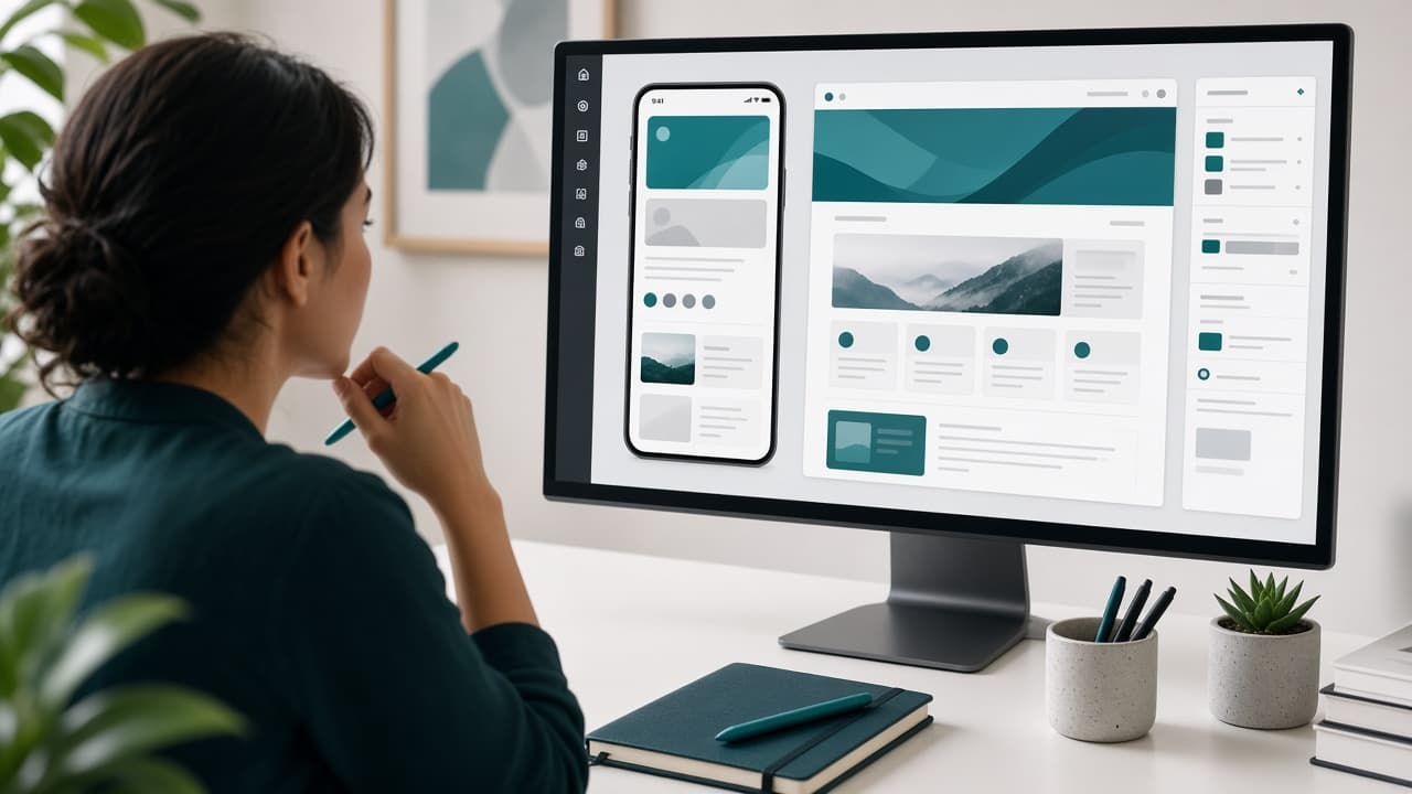
UI/UX Design That Actually Converts, Not Just Looks Pretty
A beautiful interface that confuses people isn't doing its job. Conversion-focused UI/UX design clarifies the path, strips out friction, and makes sure every screen earns its place on the page.
Pretty isn't the goal — clarity is
Somewhere along the way, a lot of businesses started treating UI/UX design as a visual exercise — pick nice colors, use a trendy font, add some subtle animation, and call it a day. The problem is that none of those choices move the needle if the person looking at your screen doesn't know what to do next. Beauty without clarity is decoration, not design.
Good UI/UX design is closer to persuasive writing than it is to decorating. Every screen is making an argument: here's what we offer, here's why it matters to you specifically, and here's exactly what to do if you're convinced. When that argument is clear, conversions follow. When it's buried under five competing visual elements, even gorgeous design falls flat.
This isn't an argument against aesthetics — visual quality absolutely matters for trust and brand perception. It's an argument for sequencing: solve clarity first, then make the clear version beautiful. Reversing that order is how teams end up with award-worthy mockups that quietly underperform in the real world once actual users start clicking around.
Conversion starts with knowing the one next step
Before any wireframe gets drawn, every page needs one clear answer to the question: what's the single most important action a visitor should take here? Not three options. Not five. One. If your homepage has five competing buttons fighting for attention, you haven't built a funnel — you've built a committee meeting, and committees rarely convert strangers into customers.
This doesn't mean secondary actions can't exist. It means there should be an obvious visual hierarchy: one primary action that's unmistakably the main point, and everything else quietly supporting it rather than competing with it for the same attention.
A simple test: cover everything on the page except the first screen's worth of content (what people see before scrolling). Can a stranger tell, within a few seconds, what you offer and what they're supposed to do about it? If not, that's the first thing to fix — before any other design decision matters.
The anatomy of a page that actually converts
High-converting pages tend to share a predictable structure, even across very different industries. Understanding the role each section plays makes it much easier to diagnose why a specific page is underperforming instead of guessing at random fixes.
Above the fold: the five-second pitch
The first screen a visitor sees — before any scrolling — needs to answer who this is for, what you offer, and why it matters, in roughly the time it takes to glance at a shop window while walking past. A strong headline, a supporting line of clarification, and one clear call-to-action button is usually enough. Resist the urge to cram your entire value proposition into this space.
Trust signals placed where doubt actually shows up
Testimonials, client logos, certifications, and guarantees don't need to live in one isolated 'Testimonials' section buried at the bottom. They're more effective placed right where a visitor would naturally hesitate — near a pricing table, right before a signup form, or beside a bold claim that benefits from immediate proof.
A call to action that removes rather than adds friction
The final push toward conversion should feel like the easiest, lowest-risk step imaginable, not a leap of faith. 'Get a free quote' feels safer than 'Buy now' for a considered purchase. 'See pricing' feels safer than a vague 'Learn more' that doesn't set clear expectations about what happens next.
Reduce cognitive load on forms and flows
Long forms with unclear labels are one of the most reliable ways to lose a lead who was otherwise ready to convert. Every additional field, every unclear label, every moment of 'wait, why do they need this?' adds friction, and friction compounds — a form that feels mildly annoying at field three can feel genuinely frustrating by field eight.
Breaking a complex intake into clearly labeled steps, showing visible progress, and asking only for information you genuinely need to respond well tends to significantly outperform a single intimidating wall of fields. People tolerate multi-step flows surprisingly well when each step feels small and the progress is visible.
- One primary call-to-action clearly visible above the fold
- Consistent, specific button language — 'Request a quote' beats a generic 'Submit'
- Error states that clearly explain how to fix the problem, not just that one exists
- Mobile-first tap targets with enough spacing to avoid frustrating mis-taps
Visual hierarchy: guiding the eye on purpose
Visual hierarchy is the quiet work of controlling where someone looks first, second, and third on a page, using size, contrast, spacing, and color deliberately rather than letting every element compete at equal visual weight. Without it, a page becomes visual noise — technically containing all the right information, but failing to communicate what matters most.
A common mistake is treating every piece of content as equally important, which paradoxically makes nothing feel important. Strong hierarchy means being willing to visually de-emphasize secondary information so the primary message and the primary action genuinely stand out, rather than getting lost among supporting details.
Whitespace plays a bigger role here than most people expect. Crowded pages feel busy and overwhelming even when the actual content is reasonable. Deliberate breathing room around key elements — your headline, your main CTA, your pricing — signals importance just as effectively as bold text or bright color.
Color contrast deserves the same deliberate attention. A primary button in a muted, low-contrast shade can get visually lost against a busy background, even if it's technically the biggest element on the page. The goal isn't to make everything loud — it's to make sure the one thing that matters most is unmistakably easy to spot at a glance.
Mobile-first isn't optional anymore
For most businesses in 2026, more visitors arrive on a phone than a desktop computer, especially from search and social traffic. Designing for desktop first and then 'adapting' for mobile as an afterthought almost guarantees a worse experience for the majority of your actual visitors — the exact opposite of what a conversion-focused process should prioritize.
Mobile-first design forces useful discipline: smaller screens have no room for five competing CTAs or an oversized hero image stuffed with text. Designing the constrained version first, and then expanding thoughtfully for larger screens, tends to produce clearer results on both ends than the reverse approach.
Pay particular attention to tap target size, form field usability with a mobile keyboard, and page load speed on an actual phone connection rather than a fast office Wi-Fi network. A slow or fiddly mobile experience quietly bleeds conversions that never show up as an obvious, easily diagnosed bug.
Design systems keep conversions consistent at scale
When every new landing page invents its own button style, spacing rules, and color choices from scratch, trust quietly erodes across a site, even if each individual page looks fine in isolation. Users build an unconscious sense of 'how this brand works' as they move between pages, and inconsistency breaks that sense in small, hard-to-name ways.
A lightweight design system — a defined type scale, a consistent color palette, a small library of reusable components — keeps new pages converting at a similar rate to the pages that already work, instead of each new page becoming its own uncontrolled experiment with unpredictable results.
We design interfaces for marketing websites, SaaS products, CRM dashboards, and internal admin panels with the same underlying principle: beauty earns its place when it actively helps someone finish a task faster or with more confidence, not when it exists purely for its own sake.
Common UI/UX mistakes that quietly kill conversions
Most conversion problems trace back to a short, repeatable list of patterns rather than some mysterious, unfixable flaw in the product itself. Recognizing these patterns is usually the fastest route to meaningful improvement.
- Multiple competing calls-to-action with no clear primary action
- Pricing or key information hidden behind extra clicks that could be avoided
- Generic stock imagery that adds visual noise without building real trust
- Forms asking for information that isn't actually needed to respond well
- Slow-loading pages that lose impatient visitors before the content even renders
- Inconsistent navigation or terminology that makes a site feel disjointed
How to test whether a design actually converts
Opinions about design are everywhere; evidence is scarcer. Before declaring a redesign a success, define what you're measuring: form completion rate, click-through rate on the primary CTA, time to complete a key flow, or actual booked calls and sales depending on your business model.
Simple, low-cost tests go a long way before investing in a full formal A/B testing program. Watching a handful of real users attempt a key task — even informally, over a screen share — often surfaces more useful insight in thirty minutes than weeks of staring at analytics dashboards without that direct context.
For higher-traffic pages, structured A/B testing of specific variables — headline wording, CTA color and label, form length — can validate design decisions with real data instead of internal opinion. For lower-traffic pages, usability testing with a handful of real users is usually more practical and still highly informative.
Accessibility is a conversion lever too, not just compliance
Accessibility often gets filed under 'legal requirement' or 'nice to have,' which undersells how directly it affects conversions. Sufficient color contrast, legible font sizes, and clear focus states for keyboard navigation don't just help users with disabilities — they make the interface easier for everyone, including someone glancing at their phone in bright sunlight.
Accessible forms, in particular, tend to convert better across the board: clear labels (not just placeholder text that disappears when typing starts), visible error states, and logical tab order reduce confusion for every single user, not only those using assistive technology.
Treating accessibility as a design input from the start, rather than an audit checklist applied after launch, usually produces a cleaner, more usable interface overall — the kind of side benefit that pays for itself even if accessibility compliance were never a specific project requirement.
There's also a quieter business case worth mentioning: avoiding accessibility entirely narrows your potential audience in ways that are easy to overlook until a customer, a partner, or a procurement checklist specifically flags it. Building it in early is almost always cheaper than retrofitting it under pressure later.
Working with a UI/UX partner: what good collaboration looks like
A strong design partner asks about your actual business goals and conversion metrics before opening a design tool, the same way a good developer asks about function before touching code. If a design conversation jumps straight into color palettes and font pairings without first discussing what success looks like, that's a sign the process is skipping a crucial step.
Good collaboration also means the designer pushes back constructively when a stakeholder's personal preference conflicts with what tends to actually convert — politely, with reasoning, not just blind agreement to keep the client happy in the moment. The best design partnerships involve healthy, respectful friction, not pure compliance with every request.
A simple before and after mental model
Picture a services business whose homepage opens with a large, moody hero image, a vague tagline about 'excellence' and 'innovation,' and three equally-sized buttons labeled 'Learn More,' 'Our Story,' and 'Contact.' It looks polished. It converts poorly, because nothing tells a visitor what to actually do or why they should care within the first few seconds.
Now picture the same business with a clear headline naming the specific problem it solves, one sentence establishing who it's for, a single prominent 'Get a free quote' button, and a short trust signal — a client logo or a specific result — placed right beside it. Nothing about the visual polish needs to drop. The clarity simply moved to the front of the design process instead of being an afterthought layered on top of a pretty but vague layout.
Onboarding Flows: The First Conversion After the Conversion
Getting someone to sign up, book a call, or start a trial is only the first conversion. For products and services with any kind of ongoing relationship, what happens in the first few minutes or days after that initial action determines whether the conversion actually sticks, or whether the person quietly disappears before getting real value.
A weak onboarding flow drops a new user into an empty state with no clear next step, assuming they'll figure out the value on their own. A strong onboarding flow actively guides them toward the moment the product or service actually proves its worth, as directly and quickly as possible, without burying that moment under unnecessary setup steps.
This matters for conversion-focused design specifically because a business measuring success purely by signup rate can end up optimizing the wrong thing — driving more people through a front door that a meaningful share of them walk right back out of. Tracking what happens immediately after the initial conversion is just as important as tracking the conversion itself.
A simple practice that helps: map out the first five minutes of a new user's experience, step by step, and ask at each step whether it's moving them toward value or just asking them to do more setup work. Any step that doesn't clearly serve the first goal is worth questioning, deferring, or cutting entirely from that critical early window.
- Identify the single 'aha' moment that proves value fastest, and design the flow to reach it quickly
- Defer optional setup steps until after that first moment of value, not before it
- Use progress indicators so users know how close they are to getting started
- Follow up directly (email, in-app message) with anyone who stalls partway through onboarding
Dark Patterns: Short-Term Conversion Tricks That Cost You Long-Term
It's worth drawing a clear line between conversion-focused design and manipulative design, because the two get confused more often than they should. Dark patterns — hidden unsubscribe links, pre-checked add-on boxes, confusing cancellation flows designed to frustrate someone out of leaving, artificial urgency with fake countdown timers — can genuinely lift short-term conversion numbers while quietly damaging trust in ways that show up later as refund requests, chargebacks, bad reviews, and customers who never come back.
The distinction that matters: good conversion design removes friction from a decision the user already wants to make. Dark patterns add friction to a decision the user wants to make in the opposite direction, or create a false sense of urgency to rush a decision they'd otherwise think through more carefully. One respects the user's actual intent; the other exploits a moment of inattention against it.
Beyond the ethical argument, there's a practical one: customers increasingly recognize these tactics, and the reputational cost of getting called out publicly for a dark pattern — a screenshot of a deceptive cancellation flow shared widely online, for instance — tends to outweigh whatever short-term conversion lift it produced. Designing for genuine clarity and ease, even when it means an easier cancellation process, tends to build the kind of trust that compounds into repeat business rather than one-time conversions you have to keep fighting to replace.
Closing thoughts: design that earns its place
Conversion-focused UI/UX design isn't about stripping away personality or settling for boring, generic layouts. It's about making sure every visual choice is working toward a clear outcome, rather than existing purely because it looked good in a mood board. The best-converting interfaces often look understated at first glance, precisely because nothing is competing for attention it hasn't earned.
If your current site or product looks fine but isn't converting the way you'd expect, the fix is rarely a complete visual overhaul — it's usually a handful of targeted changes to hierarchy, flow, and messaging clarity. If you'd like a second set of eyes on where your interface might be quietly losing people, ZEE Sol Tech's design team is happy to walk through it with you and point to specific, fixable issues rather than vague design advice.
Frequently asked questions
What's the real difference between UI and UX design?+
UX (user experience) covers the overall flow, structure, and logic of how someone accomplishes a task — the thinking behind the design. UI (user interface) covers the specific visual and interactive elements — buttons, colors, typography, spacing. Good conversion design requires both working together, not one without the other.
How do I know if my website's design is hurting conversions?+
Look at specific signals: high bounce rates on key landing pages, low form completion rates, or users dropping off at a particular step in a flow. Watching a handful of real users attempt a core task, even informally, often reveals friction points that analytics alone won't clearly show.
Should I redesign the whole site or just fix specific pages?+
In most cases, targeted fixes to high-traffic or high-intent pages — your homepage, pricing page, or main conversion form — deliver faster, lower-risk improvement than a full site overhaul. Reserve a complete redesign for when the underlying brand, structure, or technology genuinely needs to change.
How long does a conversion-focused UI/UX redesign take?+
A focused redesign of key pages — homepage, pricing, and a core conversion flow — typically takes three to six weeks including research, design, and testing. A full site-wide redesign with new design systems and multiple page types usually takes six to twelve weeks depending on scope.
Do I need formal A/B testing to improve conversions?+
Not necessarily, especially for lower-traffic pages. Structured A/B testing works best with meaningful traffic volume. For many businesses, qualitative usability testing with a handful of real users and careful review of analytics drop-off points provides enough signal to make confident design decisions.
What's a reasonable budget for UI/UX design work?+
Targeted redesigns of a few key pages often range from a few thousand dollars up to the low five figures depending on complexity and research depth. Full product design systems for SaaS platforms or larger sites typically cost more, scaling with the number of distinct screens and flows involved.
Does good UI/UX design actually affect SEO?+
Yes, indirectly but meaningfully. Search engines factor in signals like page speed, mobile usability, and engagement metrics such as bounce rate and time on page — all of which are directly shaped by UI/UX quality. A confusing or slow interface can quietly undermine SEO performance even with strong content.
What's the difference between good conversion design and manipulative dark patterns?+
Good conversion design removes friction from a decision the user already wants to make. Dark patterns — hidden unsubscribe links, pre-checked add-ons, artificial urgency, confusing cancellation flows — add friction in the opposite direction or pressure a rushed decision. Dark patterns can lift short-term numbers but tend to cost more long-term through refunds, bad reviews, and lost repeat business.
How important is onboarding for conversion-focused design?+
Very — signup or purchase is only the first conversion. What happens in the first few minutes afterward determines whether that conversion actually sticks. A strong onboarding flow guides new users quickly to the moment the product proves its value, deferring optional setup steps until after that moment rather than before it.
Keep reading
Related articles

E-Commerce Website Features That Actually Sell (Not Just Look Nice)
A beautiful online store with a clunky checkout still loses sales. Here's a practical rundown of the e-commerce features that genuinely move the needle on conversion rate — and the ones that are mostly for show.

The SEO-Friendly Website Checklist Every Business Needs Before Launch
Plenty of agencies claim their websites are 'SEO-friendly' and then hand over a site with slow load times, broken heading structure, and zero thought given to how search engines actually crawl it. Here's the checklist that matters.

When You Actually Need Custom Software Development (And When You Don't)
Custom software isn't always the right call — sometimes a well-configured off-the-shelf tool does the job for a fraction of the cost. Here's how to tell the difference before you commit a budget to a build.